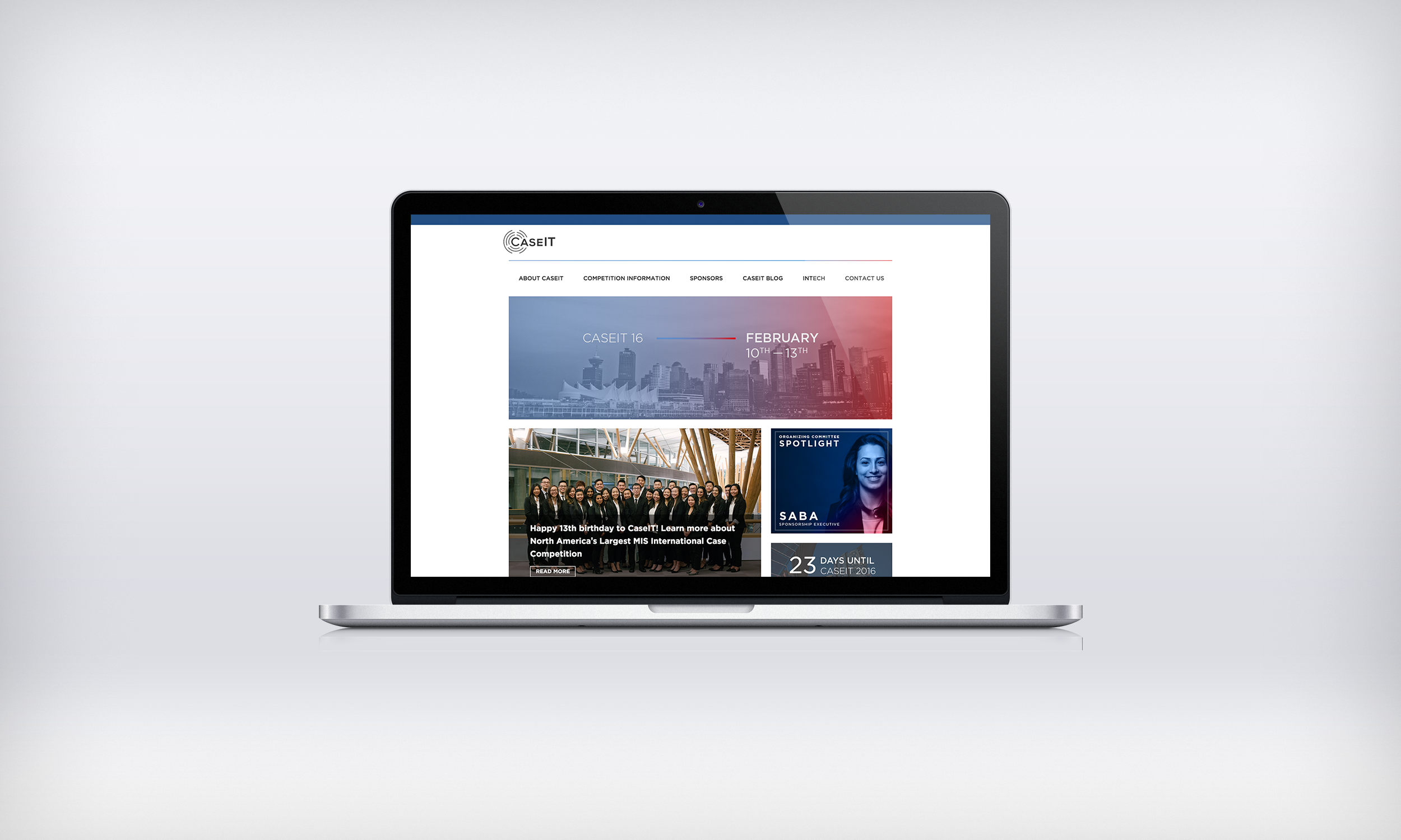
New CaseIT.org Web Experience shown on a Laptop Mockup
A project to establish a digital online strategy for CaseIT as well as take from concept to completion a series of 3 websites that catered uniquely to each of CaseIT's customer segments.
For
CaseIT (Client)
Type
UX/Strategy, Digital Product
Date
2015 - 2016
Role
Strategy, UX/UI, Wireframe, Mockup, Develop
Team
Bruce Beh & CaseIT Design Team (Visuals)
Software/Tools Used
Illustrator, HTML/CSS, Axure, WordPress, PHP/MySQL
Founded in 2014, CaseIT is an annual undergraduate business case competition where students from around the world come to Vancouver, BC and compete in a 24 hour technology case, reflecting on business problems found in the industry today. The best solution is presented in front of a panel of industry professionals and judges.
Although marketed as a technology case competition, CaseIT was lacking an online presence that resembled the level of expertise and calibre of professionalism the competition had paralleled. As a result, the competition was falling behind in achieving a digital future.
In order to achieve the goal in a better online presence it was necessary to determine who came to the CaseIT website and why they came to the site. A journey framework was created to map out areas of concern each stakeholder had with CaseIT through the stages of awareness, discovery, finding information, attending the competition and after the competition. The results of this are summarized below.
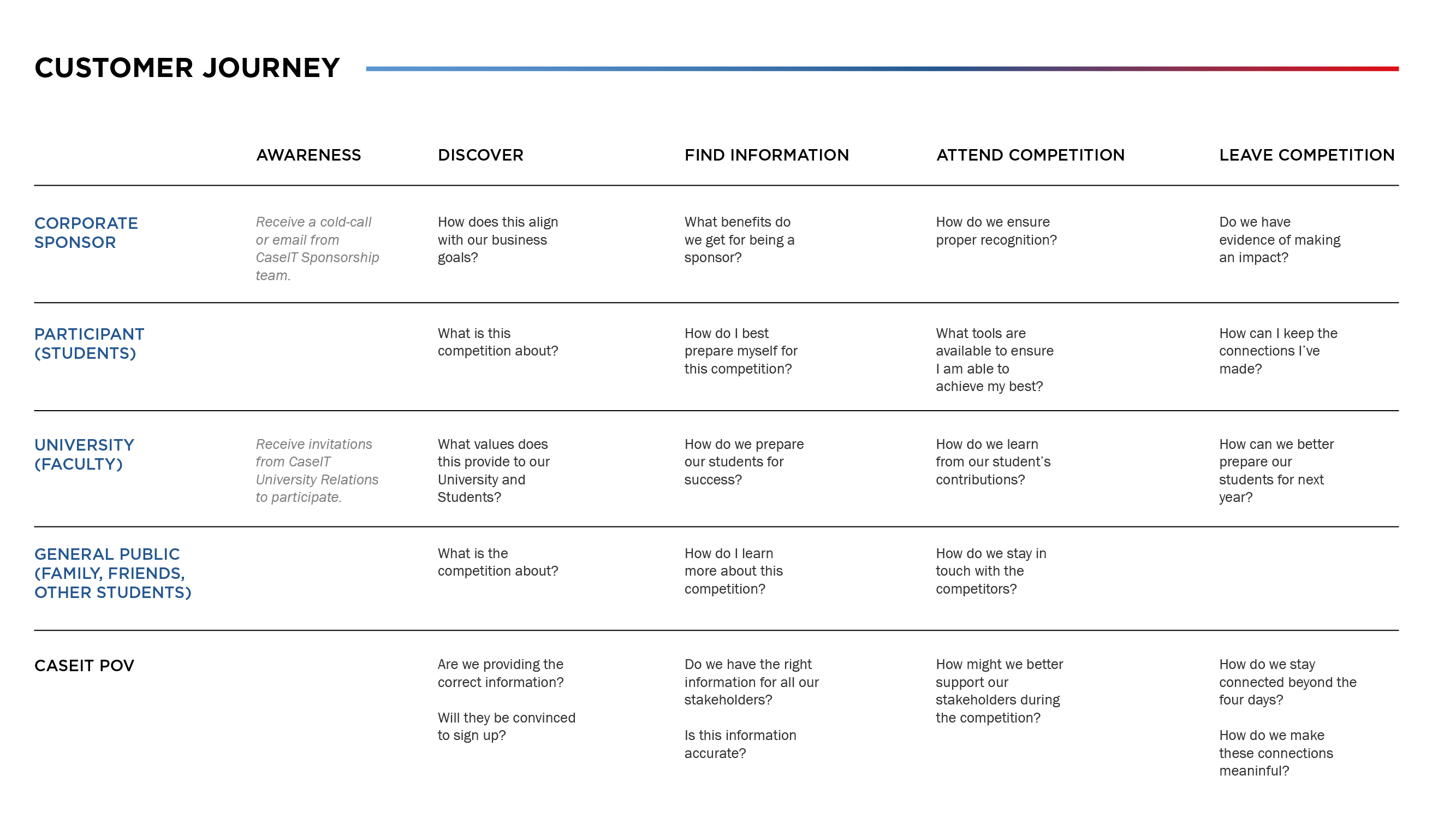

CaseIT Customer Journey Framework (Click for Full Screen)
Based on research, user feedback and analysis of CaseIT's web analytics. Each stage of our customer's journey brought on a different increase in segment of web traffic to the CaseIT website. This insight led to the proposed solution of deploying a series of three websites that catered to each customer segment based on their individual areas of concern.

Design, develop and deploy a series of three websites that catered to each customer segment based on areas of concern and addressing any pre-existing friction points.
Sponsors are what makes CaseIT possible and are typically the first major source of traffic year over year to the CaseIT website during the early stages of planning. This is because the sponsorship team starts working immediately to find new sponsors and renew previous contracts. Without the commitments of sponsors there would be no CaseIT.
We interviewed the existing and past sponsorship teams to try and determine what issues they were facing when talking to potential sponsors. Aside from funding or lack of interest we discovered the following issues.
As the design team was in the process of creating a new CaseIT Brand, we had decided to launch a microsite instead of a re-designed section of our site to ensure we were able to develope this idea quickly without having to worry about affecting the usability and experience of the existing CaseIT website.
This led to the decision of creating a Microsite which targetted only sponsors and what we had to offer. Allowing us to focus on content that was most valuable to potential sponsors eliminating the need for them to have to dig through the rest of our website for information that may not be relevant to them.
We took into account what was already in our PDF Sponsorship Package and transitioned it to a format that made sense for the web. Giving sponsors a concise overview of what CaseIT is, how previous sponsors have seen an impact, what opportunities are available and finally what benefits are avaialble in becoming a sponsor.
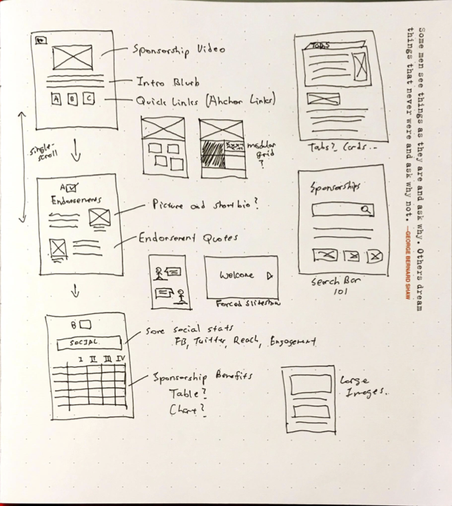
CaseIT Sponsorship Microsite initial sketches.
As the ultimate goal with the Sponsorship Microsite was to reduce and eliminate the friction points as brought up by the sponsorship team. Design decisions and user-flow was largely shaped by reducing cognitive overhead and answering the questions as presented by the sponsor segment in our customer journey framework. The single-scroll design also eliminated the need for the viewer to have to browse through a menu or click multiple links to get to their destination.
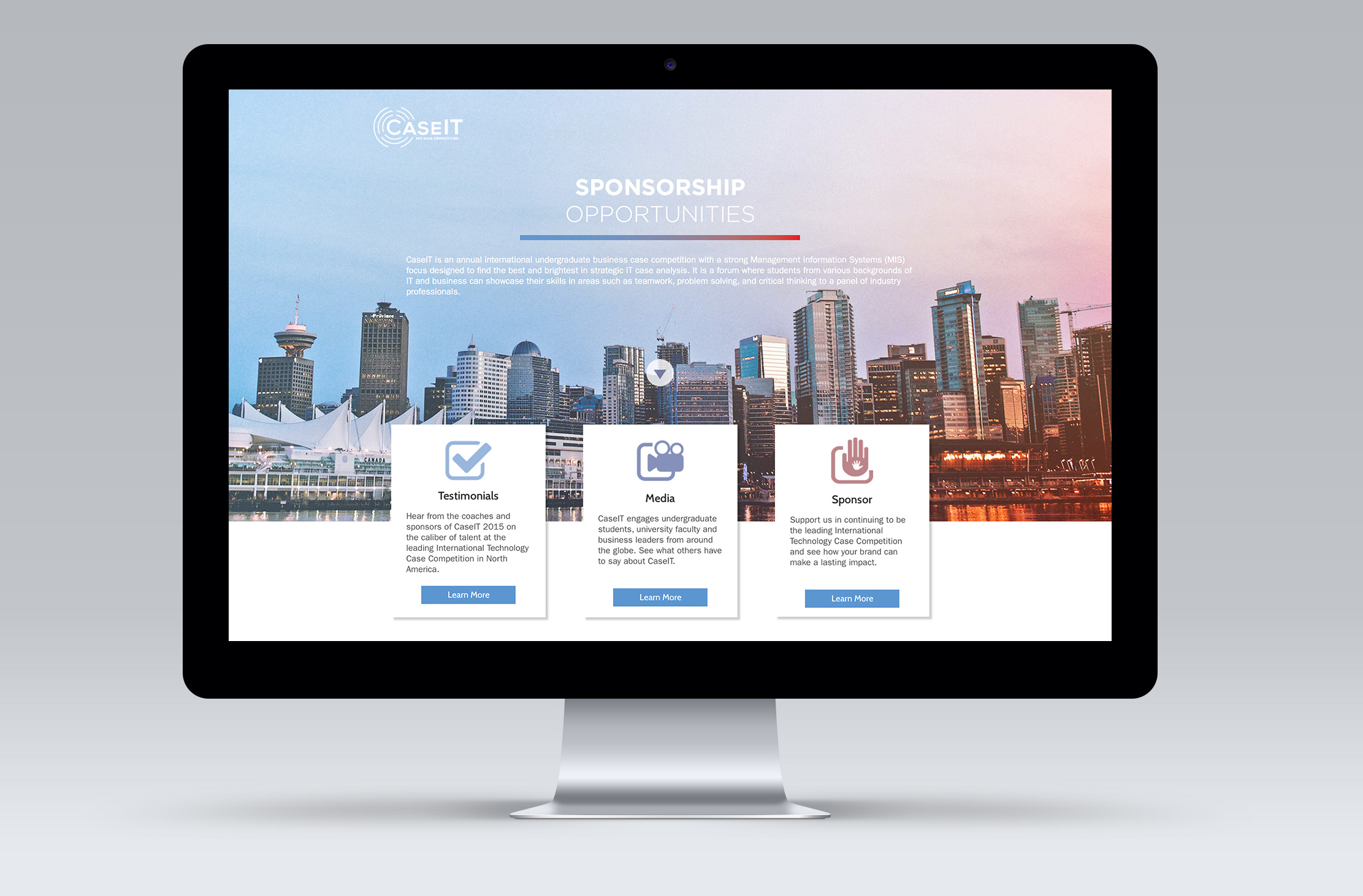
CaseIT Sponsorship Microsite shown on a Desktop Mockup.
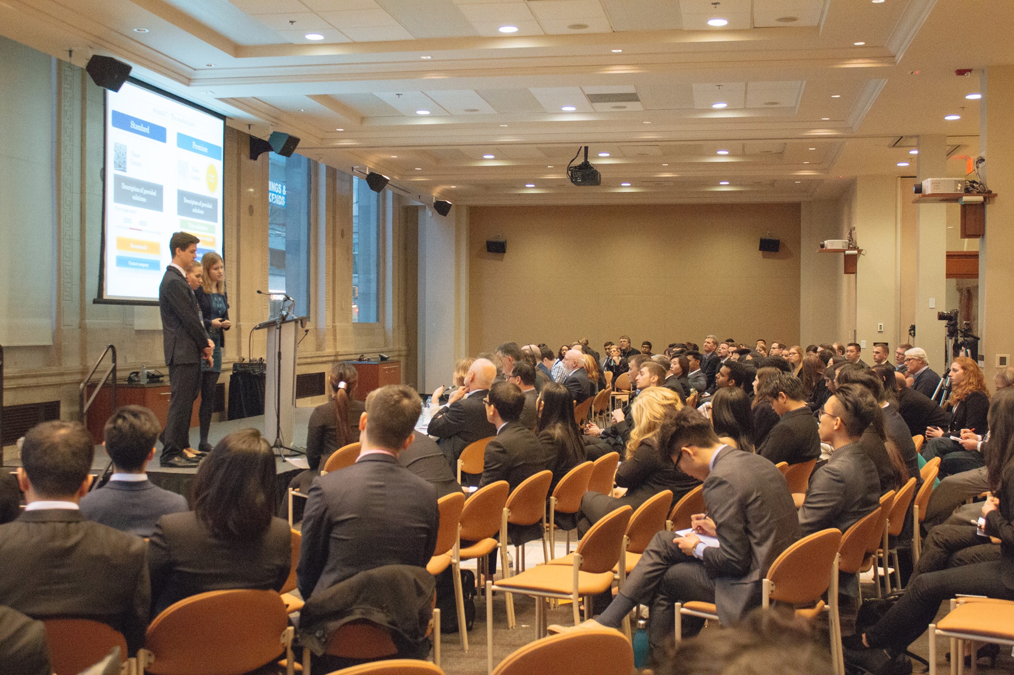
The biggest interaction between CaseIT and participants is during the week of the competition. Since our participants were University students familiar with the latest technologies our challenge was improve their CaseIT experience through technology and how we could make their experience better during the competition where stress levels may be high due to uncertainty in the environment and the nature of the competition.
In addition to talking to past participants, as a result of the competition having been around for over 10 years and having participated last year it was not hard to come up with a list of issues that our participants had during the week of the competition.
These challenges led to the creation of the CaseIT Participant Portal. The goal was to be the one source for information in regards to all things CaseIT for participants during the competition week.
Although some of the information participants were looking for was already available on the main CaseIT website. The participant portal focused on information that was relevant only for participants with much more detail and ways for participants to contact various members of the organizing committee should a question arise (which often did).
As a result the Participant Portal allowed for the following:
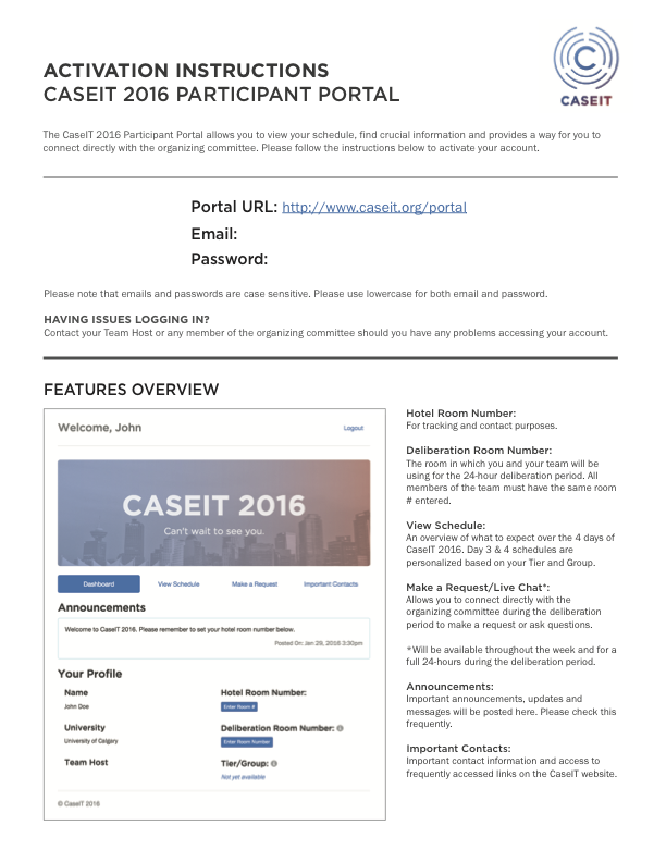
CaseIT Participant Portal Instructions.
Since participants have no prior exposure to the system before the competition week due to confidentiality reasons the system was designed to be simple to use. A rapid on-boarding instruction sheet with their account information is provided upon check-in. As the system was designed, implemented and developed in a very short period of time, the website largely represented the default visual style of Bootstrap 2.0.
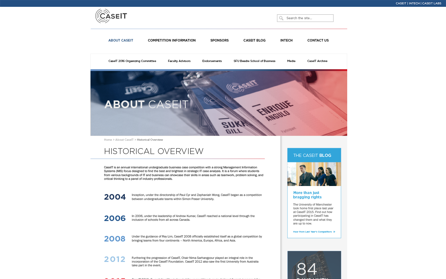
Prior to the design of the CaseIT Digital Experience the only online presence for CaseIT was the main CaseIT Website and the CaseIT Facebook Page. As a result of CaseIT being only a week-long competition once a year in Vancouver, BC. A large part of people who interact with CaseIT is through the main website.
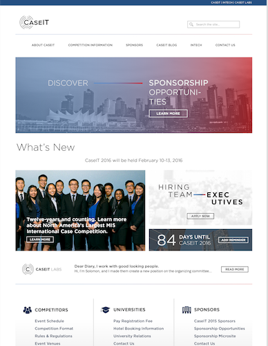
The website itself had an aging architecture and design. Information was scattered and the site had looked like it hadn't been updated for a very long time besides the change of the year from 2015 to 2016. While content was available on the website, it was not exactly easy to find.
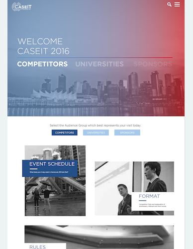
At this point it was about addressing a much wider audience. We had to cater to anyone who could come into contact with CaseIT while addressing the friction points stated above. We also needed to answer the questions that all three customer segments had from our journey framework. More importantly, we had to ensure interested schools and faculty members could find the information they need to determine whether or not CaseIT was a right fit for their students.
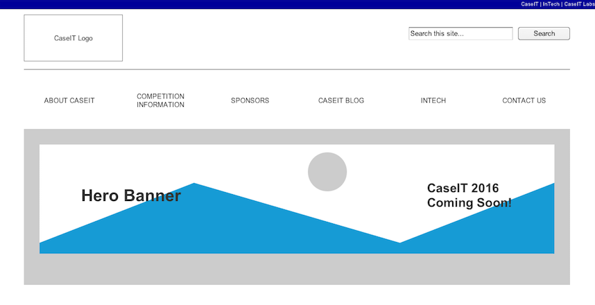
Hero Banner Wireframe
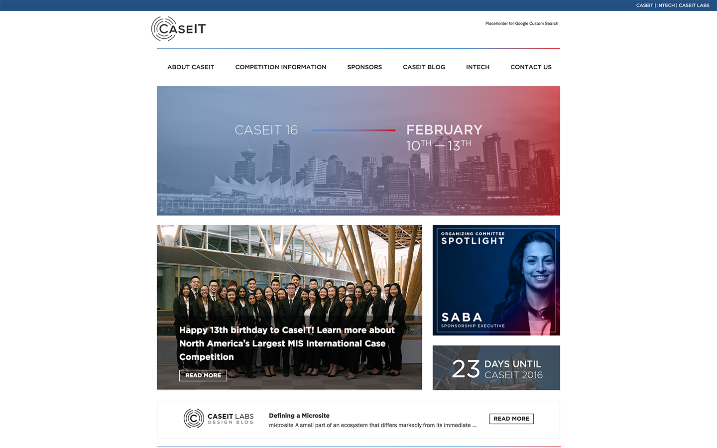
To address the display and recency of information a hero banner shows the most relevant CaseIT information at the time including any new announcements or events that were happening now.
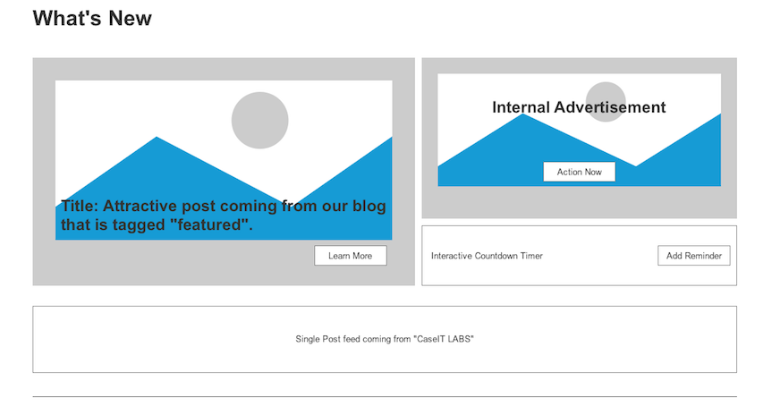
What's New Wireframe
We also added a what's new section that would display blog posts and social media posts from our various social media channels. A countdown timer here would also display the number of days until CaseIT.
As we were starting a journey into re-designing the rest of CaseIT, a section dedicated to CaseIT Labs features the process in which the CaseIT Design Team created to prepare for the competition as well as a behind the scenes look of the various things the team does to prepare for CaseIT.
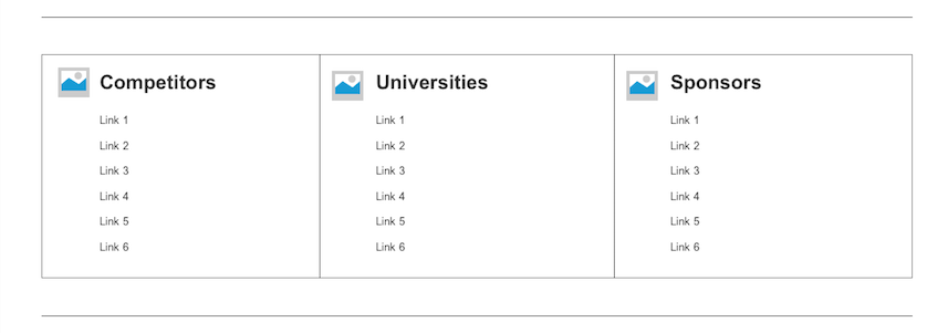
Quick Links Wireframe
We designed a quick-links menu system on-top of our existing global navigation to allow for access to most frequently accessed information.
We also ensured proper use of SEO and implemented a site-wide search powered by Google to allow for all information to be searchable should a user want to look for information through a specific keyword or search term.
Visual Experiments
We went through a few variations of visual design and possible layouts for the new website. Ultimately it was decided to follow a professional/corporate feel rather than focus heavily on visuals and added too much visual (and backend) weight to the site.
To address the lack of a physical/online presence a live-stream component of the competition was introduced for the first time. This allowed family, friends and others who were not able to make it to the finals presentation event to witness in real-time what CaseIT was like from the comfort of their home through the CaseIT website.
Final Mockups